|
|
Post by Vincent Dolan on May 5, 2011 5:12:45 GMT
Just a bit. I have yet to read the later books in the series, but I enjoyed the first one. I figured the anal retentiveness and long diatribes in the later books were because Jordan was getting on in years and closer to death's door.
Anyways, I agree with Jeff. If there's another design contest, you must submit this one. It would be an instant winner in my books.
|
|
|
|
Post by MOK on May 5, 2011 11:26:13 GMT
I shall keep this in mind! It's gone to the top of my own Things To Get When I Grow Up To Be Rich list, at any rate, herons and all (although the one on the blade still needs some work). It's good to know I can surprise myself like that.  |
|
|
|
Post by Vincent Dolan on May 5, 2011 11:45:46 GMT
Definitely. My designs are also on my Things To Get When I Get Rich list.
|
|
|
|
Post by MOK on May 10, 2011 16:17:31 GMT
This may be a bit too classic for ya damn kids these days, but some of you with good taste in comics may know of Excessus, the Sword Sinister, the trademark weapon of 2000AD's Nemesis the Warlock, created by the ever-awesome Pat Mills and Kevin O'Neil.  This is still one of my favorite comics EVER. I was born in '79 and got into comics beyond Disney (Disney comics are huge here in Europe, much bigger than their movies) in the early '90s, after the story of Nemesis had already concluded - which was perfect timing, as they were just then releasing the books in Finnish. I picked up the first TPB and found my twelve-year-old self shocked and confused. I mean, what the hell, us humans are the bad guys, an oppressive empire of religiously fanatic xenophobes? This demonic-looking alien is the hero, fighting to stop humanity from wiping out all non-humans in the universe? And he does so with a cool sword, a wicked spaceship and outright satanic magic...? ... Well, what could I say but KICK! ASS!It was love. Probably a contributing factor to my love of all things METAL, too. This sword went through several forms as the series progressed. The first time we saw it, it had been long in the possession of the human warrior M'Stron who had molded it to his own hand.  Nemesis recovered it and O'Neil subsequently gave it its classic shape, a slender, elegant longsword with a short ricasso, sharply curved guard and a pommel in the shape of a modified brazil nut or stylized eye. Suffice to say, I liked it.  Unfortunately, O'Neil had immense trouble keeping up with the deadlines and eventually Bryan Talbot took over the artwork. While Excessus retained the basics of its overall shape, the design became much less elegant and a fair bit more boring.  I feel this was true of the comic as a whole - Talbot's artwork was more realistic, but it also had a static, stiff quality to it and lacked the wild, crazy, dynamic energy and motion of O'Neil's work. IMO the writing also lost much of its anarchic edge and charm at this point, dropping the extremes of light-hearted whimsy and diabolical darkness that made the early stories stand out and becoming much more serious and conservative; at the same time, they dialed down most of the fantastic and occult elements, leaving it a significantly more plain vanilla sci-fi story. Plus they killed off Grobbendonk and replaced him with Ro-Jaws... I still liked it, but didn't love it with the burning passion I had for the series before the Gothic Empire arc. OK, now that I'm done geeking out, here's what I would like to replace Talbot's design of Excessus with.  It's considerably bulkier than O'Neil's original design, but not overly so, IMO, considering all the heavy fighting it goes through in the first couple of books. This is a pure-bred two-hander, however, measuring 52 inches overall, 38 of that in the blade and 9 in the grip (excluding the three inches of pommel that you can also grip). 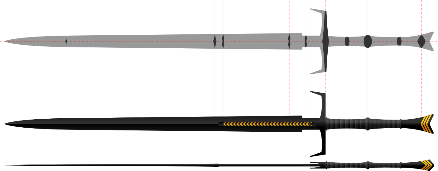 The blade has a fairly complex cross section. It starts out with a slightly narrower ricasso, then jumps up to its full width of about 2 inches as the edges begin; from there, the profile tapers linearly until it starts to curve in towards the tip. The ricasso and the rest of the forte are of a uniform thickness, the only variation caused by the profile taper, but when the fuller ends the central ridge grows briefly thicker before starting to taper again. Though the overall distal taper remains constant almost all the way to the point, the central ridge becomes gradually more pronounced and the hollow-grinding more dramatic as you go down the blade, resulting in a sort of reinforced tip and a center of balance closer to the hilt than you'd think at first glance. 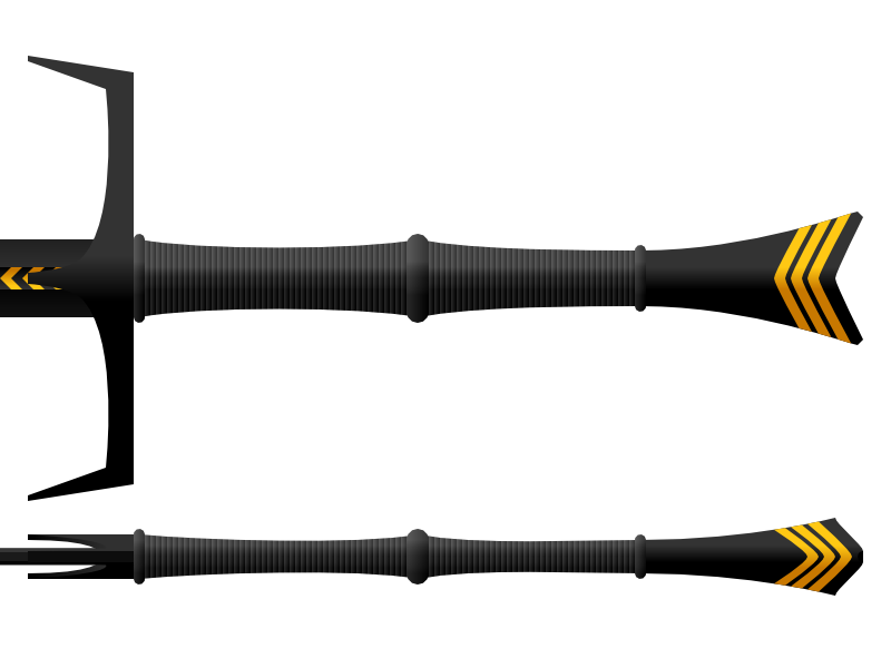 The whole sword is made of blackened steel (or rather, the exotic star metal t'cham... but let's stick to what we actually have, for now), and the grip wrapped with black leather. As you can see, I stuck with most elements of the classic design - the down-turned guard, the ricasso protected by small projections on the blade, etc. I tried to very subtly suggest cloven hooves with the pommel, and the shapes of Nemesis's face and his living ship Blitzspear with the overall lines; the gilt stripes on the pommel and in the fuller are also intended to remind one of the Blitzspear, pictured below. 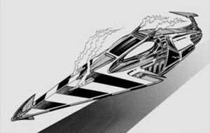 Forget that second grade Heavy Metal reject Talbot saddled him with. If we can't have Kevin O'Neil's classic vision, then this is the sword I want to see Nemesis wield as he leads the ABC Warriors into the Time Wastes. CREDO! |
|
|
|
Post by Vincent Dolan on May 10, 2011 17:02:48 GMT
Wow. That's pretty cool, MOK. Not quite my style, but still pretty cool. Reminds me that I've been meaning to redesign Anduril from LotR for awhile now.
|
|
|
|
Post by Vincent Dolan on Jun 7, 2011 3:26:33 GMT
So, never did redesign Anduril, but instead redid both Zar'roc and Brisingr from the Inheritance Cycle by Christopher Paolini. I have hated every single version I have seen, be it fan versions or the official movie one (this one I hate the most). They all look ridiculously impractical and uncomfortable not to mention only baring a passing resemblance to the descriptions. However, since my mom is asleep, I can't use her scanner, so uploading them will have to wait until tomorrow.
|
|
|
|
Post by Vincent Dolan on Jun 7, 2011 13:12:26 GMT
Here they are; the promised redesigns:   Fan designs of these two normally make their blades something like an XV with goofy looking hilts that, frankly, wouldn't be able to stop a good stout staff let alone a sword blade unless they were made of some super-steel. Plus, Zar'roc is originally described as being a cutter with minimal thrusting capabilities, yet an XV is a dedicated thruster (though capable of cutting, of course), so it only makes sense to make it into an XII. The pommel was mentioned as being a tear-drop shaped ruby the size of a small egg, yet there was a fan design of it closer to a faceted brazil nut shape; and the movie version was so close, yet so far with the tear-drop sapphire. I also opted for the broader end of the pommel towards the grip as opposed the opposite (like on the movie version) because I thought it'd be sturdier that way. As for Brisingr, well, an XV would fit in fairly nicely with the description of "making the point narrower to combat improved armor" given in the book of the same name, however, once again, Brisingr is more a cut-n-thrust weapon because Eragon said he wanted a "weapon for all occasions". Enter a bastard sword with a slightly shorter grip or an arming sword with a slightly longer grip; either way, it would be right at home used in conjunction with a shield (Eragon's preferred method), but is capable of being used two handed if necessary (although I'm not 100% on how comfortable a Type R pommel would be to grasp). The pommel shape was never mentioned, so I went with the ball shape to not only distinguish it from Zar'roc, but also to really bring out the rib styled arms holding it on. |
|
Deleted
Deleted Member
Posts: 0
|
Post by Deleted on Jun 8, 2011 16:01:37 GMT
that's what i wanted to see. a good representation of the eragon swords.
i really hate the movie versions, but i think i hate the entire movie. the movie was like when the producer saw the book he thought : ''nah, too thick, you said it had something to do with dragons?'' , then blew his budget on saphira. then grabbed some things from his attick and continued filming.
no offence to the ones who like the film, but i love the books and i think they deserve to be filmed proberly ( i'm hinting peter jackson and weta here).
now that i think of it, we need a serious redesign of arya's sword, the movie version was the first sword that i ever found really ugly.
i don't want to rant anymore here, so i just say thanks to vincent for sharing his drawing skills.
|
|
|
|
Post by Anders on Jun 8, 2011 16:22:19 GMT
I haven't read the books, but I actually found the movie a sort of guilty pleasure - it's almost as if they made it a fantasy b-movie on purpose, as kind of a homage.
I even liked Zar'roc, specifically because it looked like a horrible wallhanger. Sometimes I like to imagine a world where gaudy SLO's really are awesome weapons, you know?
*shrug* Give me a description from the book and I may take a shot at it. It's been a while since I drew up a sword.
|
|
|
|
Post by MOK on Jun 8, 2011 20:29:02 GMT
I like that Zar'roc.
And I say that as someone who couldn't stop rolling his eyes while watching the movie, and couldn't finish the book the one time I tried. To be fair, it was nowhere near as painful as Twilight - which is the other of the only two books I've quit in my entire life - but I simply couldn't think of any reason why I'd rather read it than all the classics it so blatantly rips off. It's just fanfic with the serial numbers barely filed off!
Also, gratuitous apostrophes get on my nerves. :x
But that sword, yeah, it's good. You don't see those reverse scent-stopper pommels all that often. It looks like it should be fairly comfortable to grip.
|
|
|
|
Post by Vincent Dolan on Jun 8, 2011 22:34:17 GMT
No need to feel bad. I hated the thing so much I saw it once. In theaters when I thought it would be great. My number one issue was Saphira: dragons do not have bird wings! Especially not when the book references the "membranes" of her wings at least 12 times a chapter. But I'll stop before I get on a rant about it.
MOK: Thanks. I thought about it and while a regular scent-stopper would be fine, it wouldn't be very stable with a teardrop shaped ruby for a pommel, so I inverted it and thought "that's good; the swell would fit nicely into the palm while the tail would give the pinky something to grip."
|
|
|
|
Post by Anders on Jun 8, 2011 23:19:09 GMT
I think Twilight is amazing. Simply amazing. I am honestly half convinced it's success is due to some kind of unnatural phenomenon, as if Meyer's writing contains some kind of hidden code that directly hacks into people's brains. The fact that it even got published, let alone became a bestseller, boggles the mind. Boggles the mind!
Among other things, this book has the single worst sentence I have ever seen in print. Period. Full stop. It's a masterpiece.
|
|
Lunaman
Senior Forumite
Posts: 3,974
|
Post by Lunaman on Jun 8, 2011 23:32:53 GMT
|
|
|
|
Post by Anders on Jun 9, 2011 12:09:03 GMT
Thing is, I actually get all that. I understand why the concept works; I get why the Twilight saga appeals to teenage girls and so on. I'm not talking about the shallow, unrealistic love story or why the characters make no sense.
What I mean is, the actual prose and narrative in this book is objectively poorly written by any decent standards. Having a horrible plot is one thing - you can still get lucky and have that published. Lot's of writers get away with that, because wether or not a plot is enjoyable is still slightly subjective. But I frankly don't understand how this writing made it to the printers when any good and decent editor should have sent the manuscript right back with a note reading: "Dear Ms Meyers, thank you for your time but please do not send us your raw first drafts. Your novel shows promise but needs extensive editing for us to even consider publishing it. Sincerely - Little, Brown and Company."
|
|
Deleted
Deleted Member
Posts: 0
|
Post by Deleted on Sept 5, 2011 5:49:20 GMT
This thread appears to have been hijacked by Twilight. :cry: I love this old game called Shadow Warrior, but when I took a look at the "katana" today I decided that it was a bit... over the top. Here it is, anyways. I had some ideas for it (lengthen the blade a bit and reduce the size of the spikes) but I'm going to just request something here since I have trouble drawing a stick figure on a good day.  |
|
|
|
Post by MOK on Sept 8, 2011 20:10:34 GMT
Aw, hell to tha naw! OK, here's a challenge: redo the new Conan sword. Because seriously, that thing needs a makeover. Ugliest prop weapon I've seen in a long while. A link for reference.Heeheehee. Shadow Warrior. "You move like pregnant yak!"  |
|
|
|
Post by Anders on Sept 8, 2011 21:11:31 GMT
I do have a Conan sword design in my head that I intend to put to paper soon. Though, I wouldn't call it a redo of that one as much as it is how I would design Conan's sword if given the opportunity.
|
|
|
|
Post by MOK on Sept 13, 2011 4:35:02 GMT
So, the new Conan.  Ugly damn thing, ainnit? All out of proportion, not to mention so freaking fake. I've seen latex toys at LARPs that looked less like latex toys. Now, I'm no Jody Samson, but then nobody is, and somebody's gotta do something about that eyesore. Here's what I came up with.  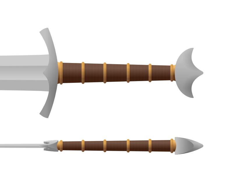 8-inch grip, 33-inch blade, 44 inches overall. I got some ideas from the pommel shape - haven't I seen something kinda like that before? Oh yeah, Oakeshott type C or Geibig 13v.II, AKA "cocked hat"! Don't see too many of those around, let's go with that. Originally I kept the bronze pommel, but that made it look as if the grip and pommel belonged to one sword and the guard and blade to another, so I changed it to iron for a more unified look. I kept the bronze bands and ferrules on the grip, but made the cross-section less uniformly tubular. Now it's a flattened oval at the guard and grows almost round near the pommel, like some types of Viking sword grips. The guard echoes the pommel design, but the biggest improvement was reducing it into proportion with the rest of the sword. I extensively modified the blade shape into something more reasonable and less awkward-looking: replaced the ridiculously bulky shoulders with just a very slight flare, extended the profile taper over the full length of the blade and the fuller all the way to the shoulders. That pyramidal shape at the base of the blade that looks like somebody welded pieces of sheet metal to it is gone, the shape merely hinted at by the pronounced ecusson on the guard. If nothing else, at the least this looks something like an actual sword blade! BTW, I went to myArmoury.com to look for reference material on the pommel shape (I still haven't got the side view quite right), and found in this thread a beautiful museum piece that's surprisingly close to a real life take on this sword: 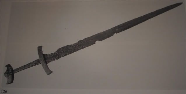 Kinda makes me wish I'd gone for that guard design. It's pretty close to what the movie version might have been had the designer had any idea what he was doing... PS. I was going to do something with that bronze medallion set in the guard of the movie sword, but couldn't find a good picture of it. |
|
Deleted
Deleted Member
Posts: 0
|
Post by Deleted on Sept 13, 2011 6:07:14 GMT
That looks... awesome! It just looks much more- real, though maybe a bit plain compared to the old Conan sword. Needs more bronze.  Indeed. :shock: I actually ended up doing it lol.  |
|
|
|
Post by MOK on Sept 13, 2011 12:59:36 GMT
It could use a little decoration, yeah - some Norse or Celtic style engravings on the guard and pommel would not go amiss. Knots, vines, gripping beasts, something like that. Maybe some inlay or simple pattern welding on the blade. But overall, it should be somewhat no-nonsense, business-like - after all, unlike the Jody Samson sword, this is not the burial weapon of an ancient Atlantean warrior king.  Hey, not bad, a nice tactical style ninja sword. It'd look pretty good in the game. Have you thought of any actual function for those notches? |
|

