admin
Site Admin
Posts: 2,094
|
Post by admin on Jun 20, 2009 10:51:35 GMT
As many of you will know I recently asked for some submissions for a new logo/header for Sword Manufacturers Guide - on This Thread in the cafe. As you see below, there were some excellent submissions - so the only way I can determine which one is the best one to use is if you guys tell me - by voting on your favorite design below (presented in the order they were submitted): DESIGN ONE: DESIGN TWO: DESIGN TWO: DESIGN THREE: DESIGN THREE: DESIGN FOUR: DESIGN FOUR: DESIGN FIVE: DESIGN FIVE: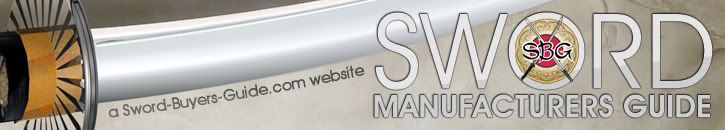 DESIGN SIX: DESIGN SIX: DESIGN SEVEN: DESIGN SEVEN: DESIGN EIGHT: DESIGN EIGHT:  DESIGN NINE: DESIGN NINE: There was another one submitted that was really GREAT, but due to the nature of SMGs hosting, the left hand nav bar has to title and the entire design will not work, but here it is - even though we can't vote on it:  Let me know what you all think! Cheers, - Paul |
|
Deleted
Deleted Member
Posts: 0
|
Post by Deleted on Jun 20, 2009 11:26:22 GMT
I take me the liberty to also link to the complete designs of the contributions; with the sidebars which can be seen in this thread;
/index.cgi?action=display&board=forumcafe&thread=10498&page=3
|
|
Deleted
Deleted Member
Posts: 0
|
Post by Deleted on Jun 20, 2009 11:38:32 GMT
dam hey are very good designs well done to the artists.
|
|
Deleted
Deleted Member
Posts: 0
|
Post by Deleted on Jun 20, 2009 12:10:41 GMT
Numbers 1 and 4 are mis-spelled -lol.
Too bad about the last one not having a working sidebar. That was my favorite by a decent margin.
|
|
|
|
Post by Brendan Olszowy on Jun 20, 2009 12:12:24 GMT
I'd vote design ten, so maybe I'll withhold my vote til something else takes my fancy. Maybe number 3?
|
|
Deleted
Deleted Member
Posts: 0
|
Post by Deleted on Jun 20, 2009 13:16:47 GMT
I like the one we can't vote on as well!
|
|
Marc Ridgeway
Member
Retired Global Moderator
"The best cost less when you buy it the first time." - Papabear
Posts: 3,122
|
Post by Marc Ridgeway on Jun 20, 2009 17:31:32 GMT
Of those... design 3
|
|
Deleted
Deleted Member
Posts: 0
|
Post by Deleted on Jun 20, 2009 17:38:58 GMT
I like number 10 as well  Oh well, I guess I'll go with #3. |
|
|
|
Post by brotherbanzai on Jun 20, 2009 17:39:00 GMT
I also prefer the one we can't vote on, # 10. Maybe whoever submitted it can re-work it in such a way that it could be used?
|
|
Deleted
Deleted Member
Posts: 0
|
Post by Deleted on Jun 20, 2009 17:40:52 GMT
Got any with swords done in detail that aren't katanas?
|
|
|
|
Post by alvin on Jun 20, 2009 18:08:47 GMT
Number 3.  |
|
Deleted
Deleted Member
Posts: 0
|
Post by Deleted on Jun 20, 2009 22:01:57 GMT
Non really have anything to do with the manufacturing of swords?
|
|
Deleted
Deleted Member
Posts: 0
|
Post by Deleted on Jun 20, 2009 22:09:05 GMT
I dig #3.
|
|
Deleted
Deleted Member
Posts: 0
|
Post by Deleted on Jun 20, 2009 23:49:36 GMT
Non really have anything to do with the manufacturing of swords? well.. what have sword buyers guide logo with a sword buyer to do? No one buys a sword on any picture on it, so what´s it all about. What have sbg forum logo with a forum to do? Nothing. And so on.. there can be differences between an educational instruction manual illustration, or a picture of an object on an ad from the local hardware store and on the other hand a design. That is not necessarily the same thing, for me at least. At least it was´nt earlier days but is perhaps what it is coming to, more and more. (I personally am stuck somewhere in the 1890´s as latest.) If a manufacturer made a banner from a manufacturers practical point of view for a manufacturers site, then it perhaps had more potential to be "technically relevant. And it is free for everyone to make one, so why not... --------- btw I must say I like nr 3 very much. Even if it is for my preferences a bit to contemporary and techno influenced I find it very skilful and tastefully executed, good job nr 3! |
|
|
|
Post by tajima on Jun 21, 2009 4:53:33 GMT
I like number four. It doesn't tie in with the rest, but I really like the design.
Thanks,
-Tajima
|
|
Deleted
Deleted Member
Posts: 0
|
Post by Deleted on Jun 21, 2009 5:35:00 GMT
Personally, I like the simplicity and color scheme of design six.
|
|
Deleted
Deleted Member
Posts: 0
|
Post by Deleted on Jun 21, 2009 5:50:20 GMT
Gotta say, i like em all a little bit...
But my favorite would be FIVE, it looks crisp & professional... Bold. SWORD, gets right to the point, and has a feeling of integrity. No wavy lines or fancy fonts, just plain bold SWORD. And what's friggin beautiful about it is, that even being as bold as it is, its so subtle that if your squint your eyes you would lose the text in the blur. Really, hats off to the person who did number five, i would like to give them a +1 when this is all done.
That design gives one the assurance that the info found within that site is going to be useful. I also like that the "A Sword-Buyers-Guide.com Website" being positioned on (or near) the cutting edge. Sort subliminal messaging that most may miss, but subconsciously register when seen. Not a primary reason for liking it, but more of a bonus!
I see THREE is in the lead,... Honestly (and please don't take offense whoever made it - or voted for it), but it looks like a baseball team logo to me. So does number TWO... When i look at those, i don't "see" swords, i see sports apparel.
FOUR & SIX are just too plain,... sort of boring. SIX is a bit more tasteful, but still not grabbing me.
ONE is interesting, but the font is all wrong. Looks sort of like the graffiti one may find in the predominately Latino neighborhoods in the city.
I like the SEVEN through NINE's, but feel that the "smoking sword" should be centered under the site name. The words are already in an arch, it seems like an obvious fit...? As it stands now, part of the "d" & most of the "e" are obscured. Really looks great though, if not for that sword being off-center. Looks unfinished.
Just to recap, please no one take offense to any of my opinions, they are after all just opinions. I have some experience in marketing, and i have always found it is best to speak plainly in regards to peoples copy. Only then do they find the corrections that need to be made in order to approve it.
All in all, hats off to all the people who contributed their designs.
Nice work...
|
|
Deleted
Deleted Member
Posts: 0
|
Post by Deleted on Jun 21, 2009 6:24:30 GMT
Gotta say, i like em all a little bit... But my favorite would be FIVE, it looks crisp & professional... Bold. SWORD, gets right to the point, and has a feeling of integrity. No wavy lines or fancy fonts, just plain bold SWORD. And what's friggin beautiful about it is, that even being as bold as it is, its so subtle that if your squint your eyes you would lose the text in the blur. Really, hats off to the person who did number five, i would like to give them a +1 when this is all done. That design gives one the assurance that the info found within that site is going to be useful. I also like that the "A Sword-Buyers-Guide.com Website" being positioned on (or near) the cutting edge. Sort subliminal messaging that most may miss, but subconsciously register when seen. Not a primary reason for liking it, but more of a bonus! I see THREE is in the lead,... Honestly (and please don't take offense whoever made it - or voted for it), but it looks like a baseball team logo to me. So does number TWO... When i look at those, i don't "see" swords, i see sports apparel. FOUR & SIX are just too plain,... sort of boring. SIX is a bit more tasteful, but still not grabbing me. ONE is interesting, but the font is all wrong. Looks sort of like the graffiti one may find in the predominately Latino neighborhoods in the city. I like the SEVEN through NINE's, but feel that the "smoking sword" should be centered under the site name. The words are already in an arch, it seems like an obvious fit...? As it stands now, part of the "d" & most of the "e" are obscured. Really looks great though, if not for that sword being off-center. Looks unfinished. Just to recap, please no one take offense to any of my opinions, they are after all just opinions. I have some experience in marketing, and i have always found it is best to speak plainly in regards to peoples copy. Only then do they find the corrections that need to be made in order to approve it. All in all, hats off to all the people who contributed their designs. Nice work... Thanks mate. +1 to you! I am a graphic designer (it is my living) who works for a marketing firm, and did many of those elements you mentioned (I designed #5) with those things in mind. There is a difference to a person who is a graphic designer for a living but likes swords, as compared to a sword-liker who happens to have a copy of Photoshop. A banner is not all about imagery and flashy fonts, but more about simplicity and professionalism while getting the message across. Really, quite honestly, the more simplistic design is usually the better. You don't just want to have a "cool banner", you want to think about the person who's never been to your site, and if they are going to take you seriously or not. Here's a link to the full design: /index.cgi?board=forumcafe&action=display&thread=10498&page=2#172517 (you can view everyone else's full designs in that thread as well) Cheers to everyone who designed a banner, it's not my intention to dis anyone. I'm just giving my professional opinion on the matter as well. I'm new to swords, and looking forward to getting my first katana very soon! I have a tanto in the mail that should arrive on Monday, and I'm very excited. |
|
Deleted
Deleted Member
Posts: 0
|
Post by Deleted on Jun 21, 2009 6:37:55 GMT
Thanks mate. +1 to you! I am a graphic designer (it is my living) who works for a marketing firm, and did many of those elements you mentioned (I designed #5) with those things in mind. I should have know! I must say, it shows in your work... Very professional indeed. Wish we had you working for our firm back when i did that sort of thing, I think we could have signed a lot more clients. +1 to you Sir |
|
Deleted
Deleted Member
Posts: 0
|
Post by Deleted on Jun 21, 2009 9:21:46 GMT
I am a graphic designer (it is my living) who works for a marketing firm, and did many of those elements you mentioned (I designed #5) with those things in mind. There is a difference to a person who is a graphic designer for a living but likes swords, as compared to a sword-liker who happens to have a copy of Photoshop. A banner is not all about imagery and flashy fonts, but more about simplicity and professionalism while getting the message across. Really, quite honestly, the more simplistic design is usually the better. You don't just want to have a "cool banner", you want to think about the person who's never been to your site, and if they are going to take you seriously or not. Should I laugh or what... yes, it has been noticed a couple of times and places that you say you are a professional designer. Just because you are(?) does´nt make everything you think or say or do more valid than what someone else does. There are a lot of so called professional people who makes a lot of crap and flood peoples mailboxes with their "work" and tell others this is how it should be and look bla bla because I´m a professional. You are not the only one who are professional but everyone perhaps don´t just do ads for the local store and looks in the first place what other with other purposes have done to try to imitate it. You can have your philosophy about it but another person can have completely different intentions with what they create. That is obviously hard to understand and respect. At votings many times the contributions have better look the way people are used to, on f.ex ad. spam of different kind a.s.o. Nothing necessarily wrong with that ( except when it becomes the always so popular collages of on the net stolen elements without any own "verkshöjd", don´t know what you call it; without altering the stolen to be the new creators own which if nothing else could make it illegal for a site to use) but it does´nt give you or anyone else the right to talk about others in a condescending manner like you repeatedly do. Because it could be that you simply don´t understand what others do and their intentions with it. I respect what you do (in the way f.ex. that I let you do it without telling you publicly that you can´t probably do anything "better) because that is the way you do it and think it should be done. I suggest you look at it in the same way. This became a voting contest. No one, at least not I, knew that from the start. It was _not my intention to participate in a voting contest. My contributions are not made with intention to win, or even participate in, any votings. Nor are they primarily some kind of advertisement for anything. It is possible to do things of other reasons and pursposes. Not necessarily better not worse, just another type of banner, with a damned whole lot of work in it by the way. |
|