Improvised Tanto (Walk-Through)
Sept 28, 2022 0:02:58 GMT
Post by steveboy on Sept 28, 2022 0:02:58 GMT
I'm still new enough at modding & customizing these things that I try to make every new project something I haven't done before, to challenge myself and to learn. Some projects, though -- like this one -- end up being more educational than I'd have liked.
What I intended was to have a panel in the saya of a tanto that looked as if an oval fire opal or moonstone -- blue-tinged white, faintly prismatic & iridescent -- were floating in a grilled panel. . I wanted a curved black grillework above the stone, kind of Art Nouveau.
I thought, If I can pull this off, it might look a bit mystical and powerful, with that stone floating impossibly in the saya. Yessir, that's what I thought.
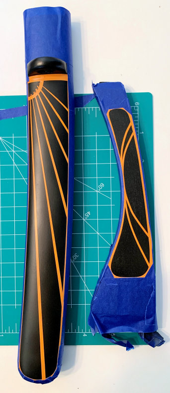
Okay, so: I started with your basic $50 roninkatana.com scratch & dent tanto:
Disassembled it, sanded down the saya, treated with TSP & Krud Kleaner, primered it black. (I'm not posting pix of the steps that are common to these customizations. I've done it plenty on previous threads if you're curious about process or materials.)
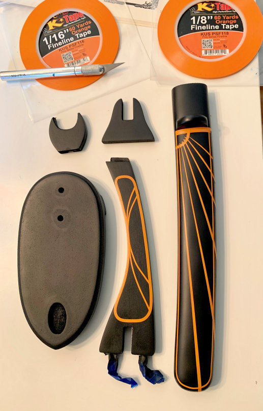
I wanted to paint a matching stand, so I readied that as well. When I taped everything off, I decided to go for straight lines and not curved, because I don't trust my fine-airbrushing skills enough yet to do the curved highlighting.
The result looked more Deco than Nouveau, but that was fine by me.
That stoopid taping took half a day. Yeesh.
The neck-cradle piece on these cheap little tanto stands is always too narrow for the saya, so I enlarged it with a rotary tool.
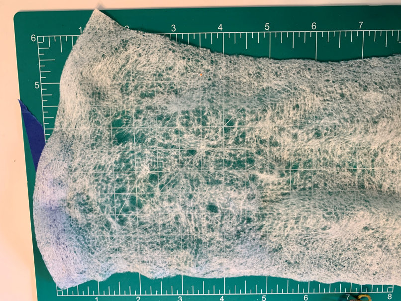
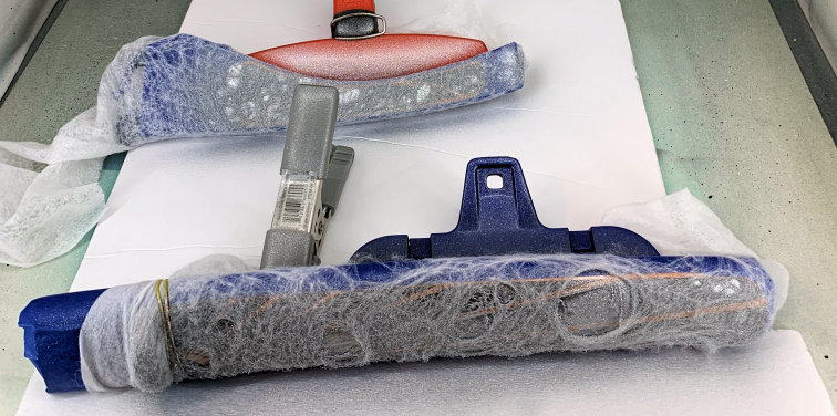
Next up was a cool trick for making a veined marble effect I'd never tried before. First you pull and stretch a baby wipe until the threads begin to separate:
Stretch it around the object to be painted and secure it (I used chip clips):
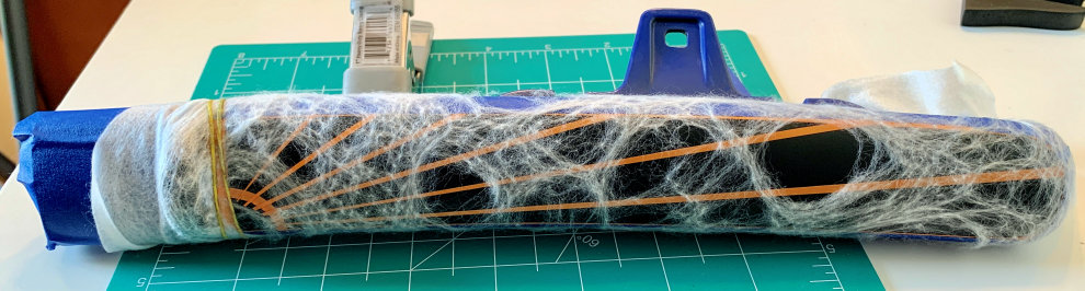
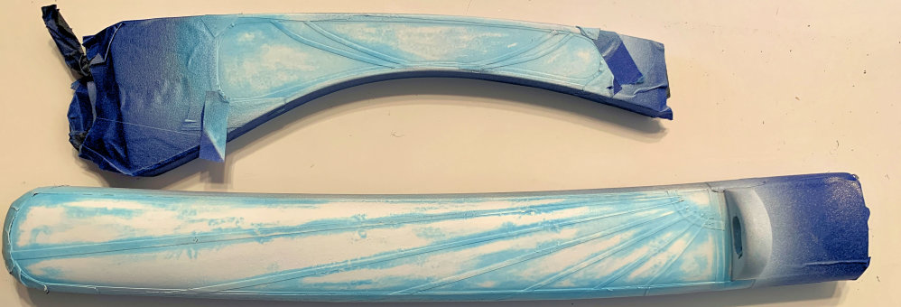
Then airbrush your background color, using the baby wipe as a stencil:
And here's where everything went off the rails. I wanted to use Metallic White with a bit of Pearl White for the main color of the stone. It has beautiful shimmer and depth, and I would add Hi Lite Blue, which would shimmer blue at certain angles.
I mistakenly thought I needed to put the metallic white over a silver background to give it reflectivity and depth. But you do that for candies; metallic white should go over a white background. I'd done it before; I should know better. D'oh.
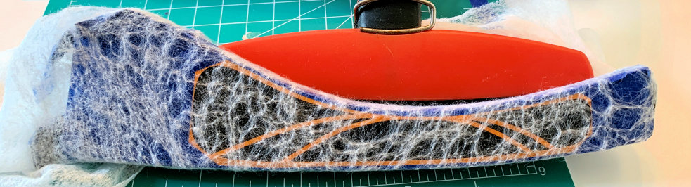
Well, nothing to do but pull the baby wipe and see what we've got:
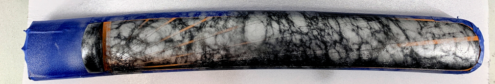
What killed me about this was that if I hadn't taped it, or if the taped color had been something other than black, the marble effect would've been awesome; I could candy it and be very happy. But those tape lines were black, and so were the marble veins. They'd just be inexplicable straight lines in the veins, and it would all be a mess.
I tried to paint the Metallic White over the silver, but it just wouldn't take. The white was too translucent, the silver too strong.
So now I had two choices: candy it and try to lay metallic white over that, or pull the tape and start over.
That tape took forever. No way.
So I candied it a nice blue. It was darker than I wanted, but I thought it might do:
Candies are dyes, not pigments, and they bleed through the next layer of paint if you don't intercoat with a blocker. So I airbrushed two layers of Bleed Checker and then tried the Metallic White:
Oh, man. The Bleed Checker did prevent leaching through the paint. But it didn't stop the candy from bleeding off the tape, and so this blue mess was blotching the white along the tape lines. I tried a couple of times, even tried lightly sanding the tape. No go.
If I still wanted my white shimmery fire opal, I was gonna have to pull everything and take it down to the bare wood again.
I literally was pulling off the first piece of tape when I thought, Hey, wait a minute. What if I paint the panel a blue that's close enough to the candy that it won't matter if it bleeds through because it'll match the new color?
I thought about what it would involve to pull the striping tape, sand, clean, redo the striping tape. Yeah, hellwiddat: Let's give the matching blue a shot.
I mixed a Tiffany Blue and airbrushed it on:
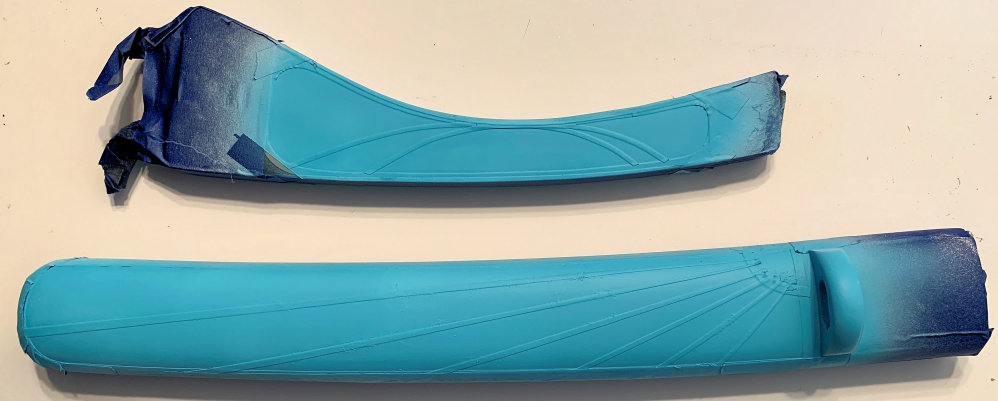
It worked! And it was a really pretty blue, too. Which was good -- because the Metallic White still wouldn't go over it. Which meant figure something else out, or start over.
Okay, well: I could use the spatter technique I used for my River Koi tanto to make this look like blue granite. Then I could render that to look more 3D, as if it's a stone floating in a grillework. Won't be shimmery & iridescent, might still look cool. Worth a shot.
I used white and different shades of the Tiffany Blue to speckle the panels and kurigata:
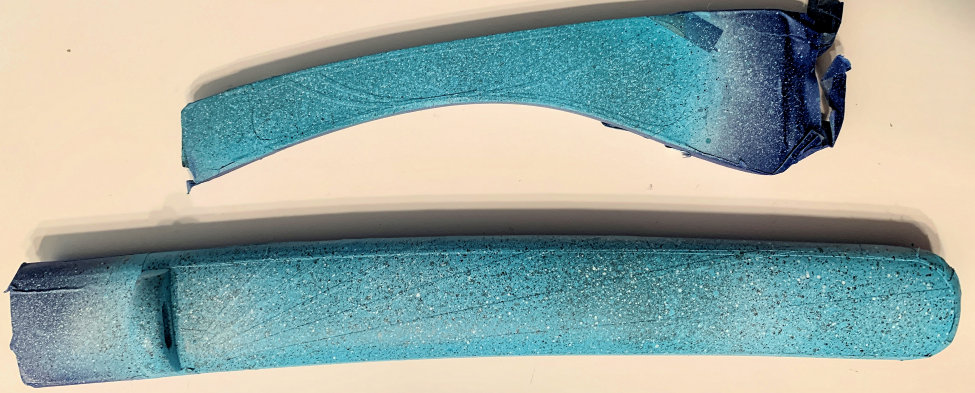
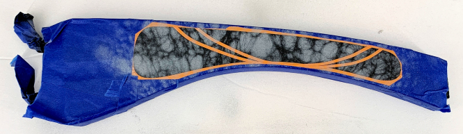
I thought it looked pretty good, and the lines would definitely show up when I pulled the tape. So I went ahead and airbrushed fades around the edges to make it look more like a stone floating in the panel:
It worked, but there was a problem: it was just too big. To look like a stone floating in the black, it should have been smaller, because the illusion depended on you seeing both rounded ends curving away into blackness. But, I told myself, if you render highlights on the framework lines and cast shadows from them onto the stone, it'll really add depth. Okay, sure.
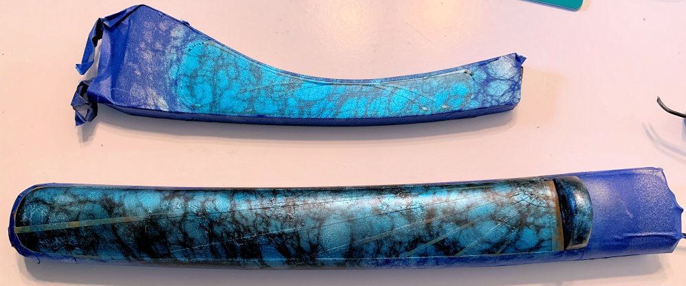
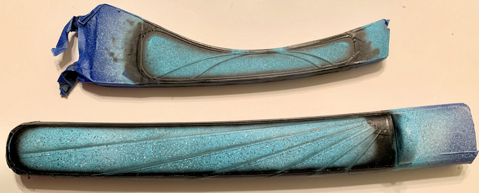
I added line shadows on the stone and pulled the tape.
That striping tape had been on there for about five days, and by now I'd piled a lot of paint layers on top of it. I ran an X-acto blade along the tape edges to keep it from pulling paint, but some sections directly beneath the tape lifted clear down to the wood.
Well, they were straight lines, and it was the easiest fix of the potential fixes I thought I might end up having to make. I shielded with plain paper and fixed the lines, trimmed bleeds with the X-acto knife, and cleaned up edges:
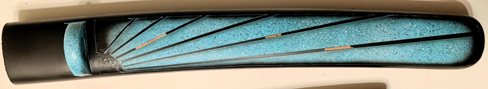
I realized that I had a different optical illusion here than what I'd been going for. For a floating stone, I needed stronger shadows from the lines; the lines needed highlights to visually separate them from the stone and give them dimension; and they needed to more obviously connect to a framework bordering the panel. It would have been a lot easier if the lines & border were a different color than the rest of the saya.
What I had instead looked like wedge-shaped pieces of stone had been laid in a pattern, and the line shadows looked like beveling, making each stone panel look raised -- stone pieces curving out of the saya, rather than one stone floating within it.
I just didn't trust my fine-line skills with an airbrush enough to render those grille lines. Nossir, if I just tell people that I set out to make me a tanto with raised Tiffany Blue stone panels, I will look like a bona fide creative-type genius. Not to mention saving myself a lot of explanation.
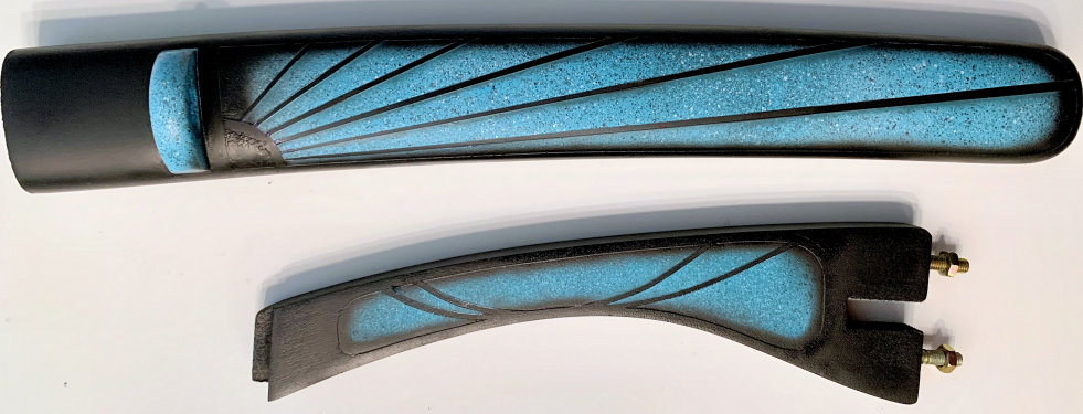
For clearcoating, I didn't want the stand to steal focus from the tanto, so I sprayed it with four coats of ultra matte water-based polycrylic.
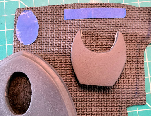
I cut shapes for the base and the cradle using highly shock-aborbent rubber meant for instrument cases so that the stand wouldn't mar the saya finish:
I glued the rubber on with E6000 and assembled the stand.
I wanted to see if I could use an automotive 2K Clear with the $10 Harbor Freight airbrush I use for clearcoating. I did a bunch of Youtube research and bought Upol 2882 Universal Clearcoat and UP2303 Fast Hardener. (I also had to upgrade my paintbox exhaust setup, because this stuff is big moby toxic). I thinned these with Tamco HR-1360 Fast Urethane Reducer. The ratio modelers use for this is 2:1:1 (2 parts clearcoat to 1 part hardener and 1 part reducer). It worked incredibly well, and the airbrush cleaned easily with acetone.
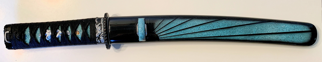
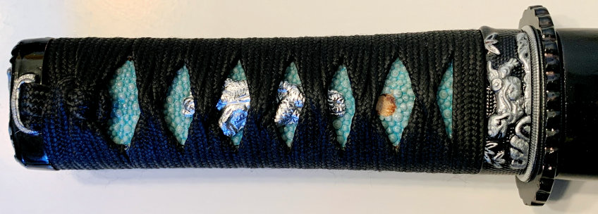
For the tsuka, I painted the same with the Tiffany Blue, then wiped it and brush-polished the nodules. I painted all the fittings black, then airbrushed the seppa, menuki, and shitodome Metallic Quicksilver, and hand-painted silver on the fuchi and kashira. I rewrapped it and brushed on a coat of semi-gloss polyurethane. (I find these smaller tsuka much harder to wrap.)
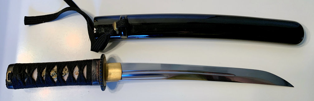
The original finish on the blade was okay but kind of dull. As long as I was going to town on this thing, I went ahead and brought it to a mirror finish with 220, 400, 800, 1500, 2000, 2500, and 3000 grit sandpapers, then Peek and Mother's Aluminum polishes. I don't know how well the difference shows in the pic, but the bottom image is the polished one:
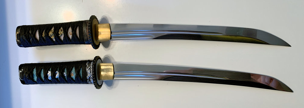
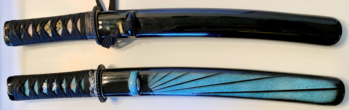
And here's the completed project on its stand:
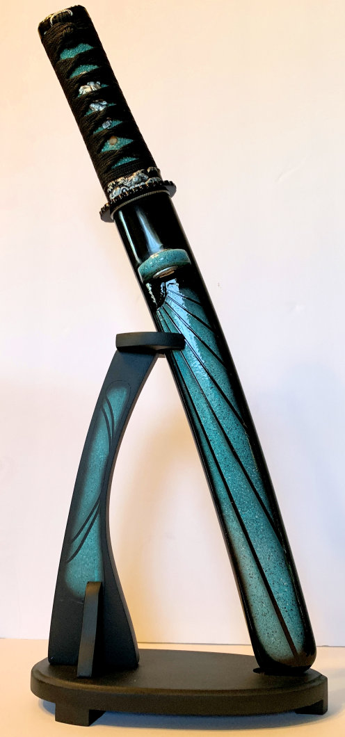
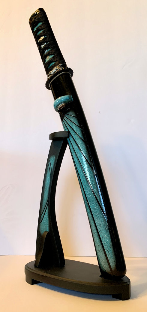
Even though it's not at all what I was originally going for, I like it. It's much less flashy than what I've done before, and as a result I think the design feels more mature and elegant (totally unintentionally).
More than the design, though, this project became a lesson in turning liabilities into assets. There were a lot of points where I should have started over, but instead I decided to see what I could make out of corners I'd painted myself into, whether through bad luck or just dumb mistakes. And especially viewed through that lens, this tanto makes me very happy.
Thanks for coming on this little journey with me!